
The Rebrand of ETAP
Case Study (2mins read)
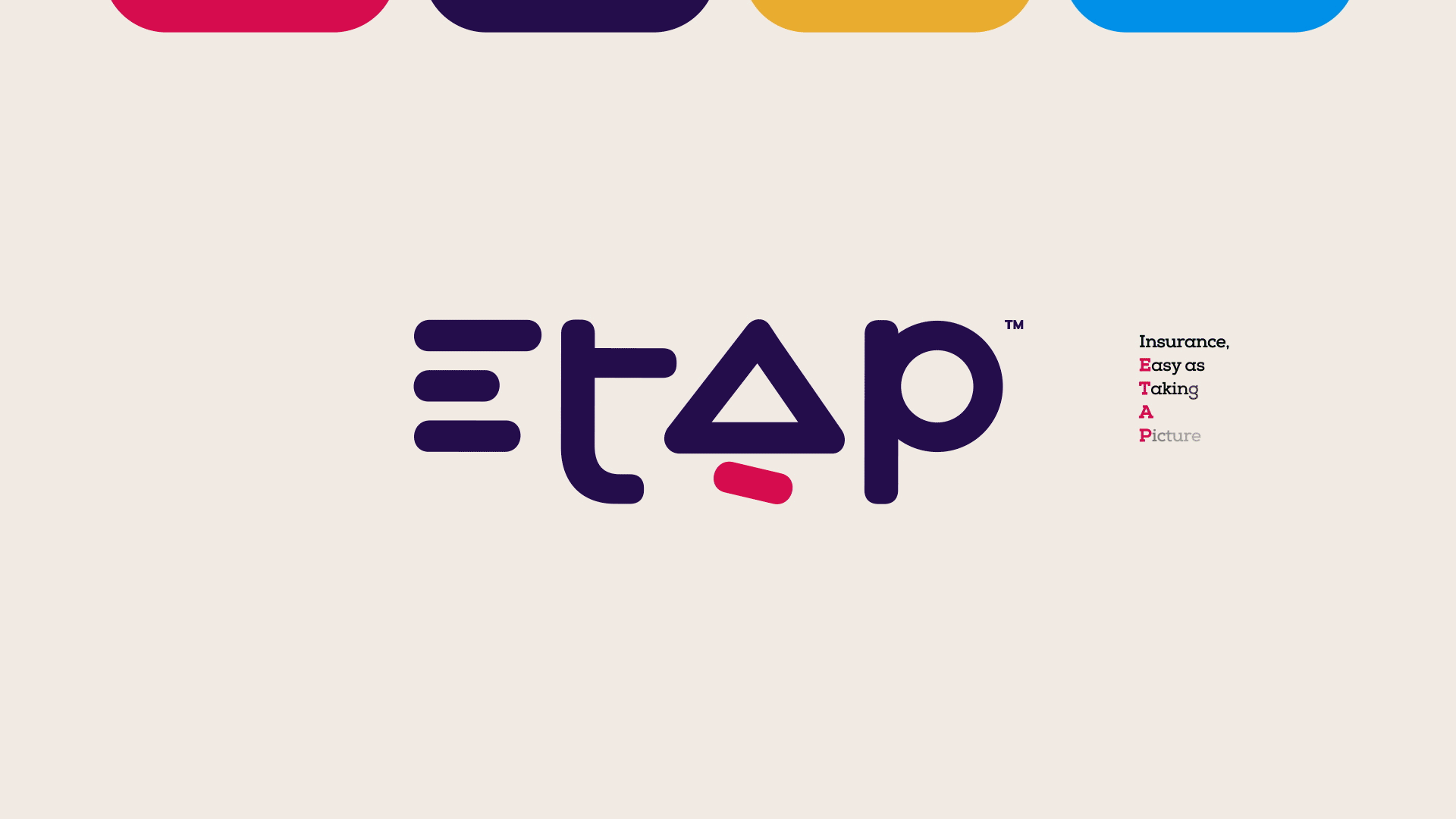
In October 2023, as Head of Brand & Design at ETAP we revealed a fresh identity, one that encapsulated ETAP's evolution as a company. It started as an itch to let the brand reflect how much it was growing, an evolution that embodies ETAP's broader mission: To redefine insurance in Africa beyond just an award-winning car insurance app. It needed a brand that could match that ambition.
The existing identity lacked cohesion, adaptability, and scalability across platforms and use cases—from product UI to partner marketing. Internally, teams were struggling with inconsistent visuals, outdated templates, and fragmented brand perception.
The brand lacked clarity, recognition, and trust. The challenge wasn’t just aesthetic—it was strategic: reposition the brand to serve a larger market while enabling internal efficiency
-
Conduct a comprehensive brand audit across internal and external channels
-
Create a modern, flexible brand identity aligned with the product vision and values
-
Build a scalable visual system adaptable across teams and global campaigns
-
Enable consistency and efficiency for marketing, product, and sales teams
-
Design two additional product sub-brands with distinct but cohesive identities
-
Develop a flexible brand architecture to accommodate product expansion
Audit & Discovery:
- Reviewed marketing materials, app UI, sales decks, and stakeholder feedback
- Identified gaps in brand consistency, tone, and visual alignment
Identity Redesign:
- Redesigned logo for better digital legibility and brand presence
- Developed core elements: color palette, type system, grid frameworks, iconography
System Building:
- Built a comprehensive design system in Figma with components, templates, and rules
- Created libraries accessible to marketing, Customer Experience, and product teams
- Documented brand usage guidelines to support internal and external partners
Sub-brand Design:
- Designed logos and brand kits for two new product offerings
- Developed visual relationships between parent and sub-brands for seamless cohesion
Collaboration:
- Worked asynchronously across marketing, Custmer Experience, product, and leadership
- Used Notion, Slack, and Figma for async check-ins, reviews, and approvals
-
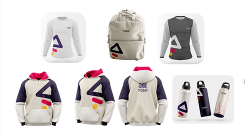
Unified brand experience across product, web, social, email, and partner campaigns
-
3x faster turnaround for design requests due to accessible design system
-
Improved stakeholder alignment and visual storytelling across departments
-
Enhanced brand perception for investors, partners, and new customers
-
Set the foundation for future product expansion and co-marketing campaigns
This Rebrand is the result of 37 iterations and about 72 cups of coffee! :)


Some Social Media Stills


Watch Rebrand Video


Click to See the Brandguide


Watch Brand Story (Wrapped)


Email Signatures
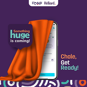
ETAPxHollard Campaign
Project Type: Market Entry Strategy, Brand Launch, Experiential Design
Role: Senior Brand Design Manager & Creative Strategist
As ETAP prepared to expand into Ghana, the goal wasn’t just to launch an app—it was to make a powerful first impression. Partnering with Hollard Ghana, the team needed a brand-led campaign that introduced ETAP’s value with clarity, confidence, and cultural relevance.
This was a brand entering a new market with an opportunity to redefine expectations around car insurance. The challenge was to translate ETAP’s features into stories—shifting the message from what it does to what it empowers people to do. We needed to ensure that the experience felt real, local, and deeply intuitive.
I led the creative development of the brand launch strategy, including:
-
Key messaging themes based on product benefits and local insight
-
Creative direction for launch storytelling and campaign rollout
-
Visual and experiential concepting for the in-person launch event
-
Writing treatments for five original brand films/ visuals, each aligned with a core product feature
We reframed ETAP’s feature set into emotionally-driven stories:
-
Fun — Have fun drivinng safe and climbing the leader board with friends
-
Control — On-demand policy options and full user autonomy
-
Transparency — Track every drive and every reward
-
Flexibility — Pay-as-you-go plans to match your lifestyle
-
Reward — Drive safe, earn points, redeem value
These themes became the foundation for five original short brand films—each used as a centerpiece during the Ghana launch experience.
The full rollout remains confidential pre-launch, but the creative direction is complete and production is underway. Key highlights include:
-
A multi-sensory launch experience designed around five brand stories
-
A visual identity system tailored for the Ghanaian market
-
Messaging that bridges ETAP’s technology with human empowerment


Ellae


Every Nanny Campaign
Project Type: Brand Identity + Website Design
Role: Senior Brand Designer & Identity Lead
We were commissioned to develop a trusted digital platform for hiring domestic staff. The client envisioned a website that would help families find dependable, professional caregivers through a safe, intuitive interface. Our goal was to craft an identity that felt warm, human, and secure.
The emotional stakes were high. We needed to create a brand that balanced trust and professionalism with empathy and warmth. The identity had to feel personal enough for families, yet structured and polished enough to instill confidence in the recruitment process.
I led the brand discovery and design process, developing the logo, core identity system, and foundational UI styling. This included:
-
Logo concept and refinement
-
Brand color palette and typography system
-
Moodboard and tone-of-voice definition
-
Collaborating on key page layouts and visual tone for the website
-
Initiating social media conversations with strong brand assets and communications
The brand launched as part of a pilot internal rollout and was met with enthusiasm for its warm, trustworthy aesthetic. The visual language created an emotional bridge between employers and potential caregivers, helping to convey safety, ease, and credibility from the first interaction.


Logo Designs


Lucky Mud Farm challenged me to create a captivating logo with a simple, rustic vintage vibe that breaks away from clichéd farm designs, seeking a unique and memorable outline style without heavy detailing. The client envisioned a one-of-a-kind mark that reflects their identity, sparking curiosity while keeping the design simple and vintage-inspired.
I delivered an intriguing logo featuring a lady’s face where a whimsical mushroom forms her nose and crowns her head as hair, blending rustic elegance with a playful organic twist to reflect their earthy, organic ethos,. Paired with clean, bold typography and delicate outline work, this design offers a fresh, identifiable look that stands out in the simplest yet most enchanting way.


