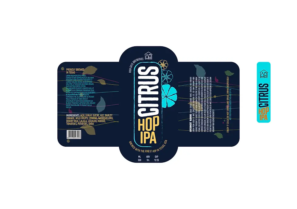
Citrus Hop IPA –
Bold, Vibrant Label Design for a Craft Beer Brand
Client: High Gate Brewery, UK
Project Type: Packaging design/ Product Branding/ Label Design
Design Role: Product label designer
The client approached me to create a bold, modern beer label that captures the refreshing essence of their new craft release, Citrus Hop IPA. They planned to launch a new beer every 6 weeks. They wanted a design that would stand out on shelves, reflect the vibrant personality of the brew, and appeal to both seasoned IPA drinkers and newcomers.
Design Solution:
Inspired by the energetic flavors of citrus and hops, I developed a label that fuses bold typography with playful, illustrative elements. A deep navy backdrop provides contrast for the bright teal and orange palette, while subtle citrus motifs and clean, contemporary type deliver a striking shelf presence. The label wraps the bottle with rhythm and color, echoing the brew’s zesty, dynamic flavor profile. The neck label adds vertical visual interest and reinforces brand identity, ensuring the product is instantly recognizable from every angle.
Key Features:
– Bold, high-contrast color palette
– Playful fruit and botanical illustrations
– Custom logotype and vertical type treatment
– Shelf standout with a modern craft beer aesthetic
– Designed for multiple production views (front, back, neck)


Initial Concept – Exploratory Phase:
This early design explored a lighter, more illustrative approach. While it communicated the product’s freshness, it was later refined to better align with the bold, modern character of the brand and target audience.
It also looked more like a wine bottle!

HauteMess Product Label

Client: HauteMess
Project Type: Packaging design/ Product Branding/ Label Design
Design Role: Product label designer
For HauteMess, I crafted a luxurious yet understated packaging design for their Gourmet Market product line, including pasta and sauce. The design strikes a neutral balance, avoiding overtly masculine or feminine tones, to appeal to a sophisticated, discerning audience. Featuring a refined color palette of soft beige, deep blue, and subtle gold accents, the packaging exudes elegance and quality. The minimalist layout, paired with clean typography and their delicate script logo, ensures a premium feel while maintaining simplicity.
A transparent window on the pasta packaging showcases the product, inviting customers to experience the gourmet quality firsthand. This design perfectly aligns with HauteMess's vision of quiet luxury and timeless appeal.
Design Solution:
A sophisticated design using a soft beige, deep blue, and gold accent palette, featuring minimalist typography and a transparent window for pasta, ensuring a premium yet understated look.
Key Features:
– Neutral color scheme for broad appeal
– Clean, elegant typography
– Transparent window on pasta packaging
– Luxurious yet simple aesthetic


Raw & Organic Brazil Nuts
Client: The True Organic
Project Type: Packaging design/ Product Branding
Design Role: Package designer
The True Organic commissioned a distinctive, health-centric packaging design for their Brazil Raw & Organic Nuts, aiming to celebrate its superfood status. The design was tasked with grabbing attention in a crowded market, emphasizing the nuts’ natural purity and nutritional potency, while resonating with eco-conscious consumers and snack enthusiasts alike.
Design Solution:
Drawing from the earthy richness of Brazil nuts, I crafted a packaging design that merges bold, hand-drawn typography with organic, flowing illustrations of nuts and leaves. A crisp white base is accented with a unique blend of deep maroon, golden brown, and vibrant green hues, creating a warm yet fresh visual identity. The layout features a dynamic scatter of nut elements that evoke a harvest vibe, paired with a sleek banner highlighting certifications and benefits. This design ensures shelf impact with its organic texture and bold contrast, while the nutritional callouts and certified organic seals (USDA, EcoCert, BKA) reinforce its premium, wholesome appeal.
Key Features:
– Maroon, golden brown, and green color harmony
– Hand-drawn nut and leaf scatter illustrations
– Bold, organic typography with a harvest-inspired banner
– Certified organic seals for authenticity


This somewaht playful yet informative design bridges the gap between fun and functionality, making it especially appealing to those who enjoy a brand with personality while maintaining trust in its health and environmental credentials.
***design was never used!
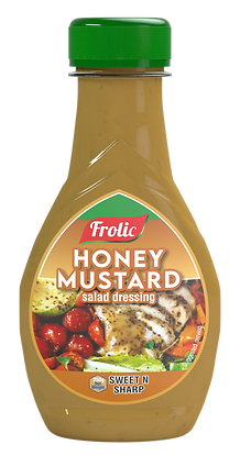
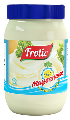
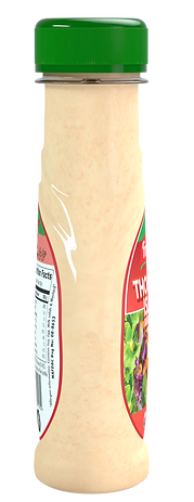
Frolic
Client: Frolic Foods
Project Type: Product Viz
Design Role: Modeling, Texturing, Lighting & Rendering
Frolic commissioned 3D renders of their product line, including Garlic Mayonnaise, Suya Mayonnaise, and other condiments, for use on their website and social media platforms.
The goal was to create visually appealing, high-quality renders that showcase the product packaging in a realistic and engaging manner to enhance their digital presence and attract customers.
I developed a series of detailed 3D renders that highlight Frolic’s condiment packaging with a focus on realism and vibrancy. Each render captures the jar’s texture, color, and label design with precision, using soft lighting and subtle shadows to create depth.